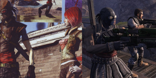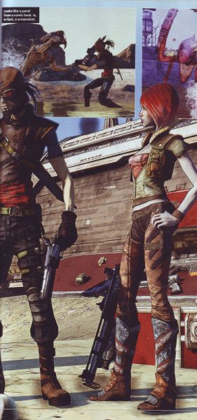
Gearbox's game Borderlands has changed it's look and is now cel shaded rather than realistic. I have photos here that you can see the difference.
Though there's always the chance some people could be turned off by the style, it was decided that, overall, it fits the game and creates a more visually interesting experience. Our concept art had this incredible, distinctive style and feel that fit so perfectly - the game has not become less detailed or washed out at all. Rather, it retains the detail and style that's often lost when we move from concept art to 3D. It stands out, and makes the gray-and-brown bleak landscapes, while still bleak and inhospitable, memorable and recognizable. The entire world has life to it, from the creatures to the very rocks and dirty walls. The game world is no less gritty, dirty, or harsh - all of the detail is there, and the environments have even more atmosphere. We solicited feedback from our focus testing initiative, which consists entirely of a very large pool of gamers from all walks of life, and in the end, the choice was clear for us."
"Whether or not you are excited about the art style, the core gameplay is still the same: gritty, fun co-op FPS action on an alien frontier world with RPG elements and a metric shitton of guns. And it is a hell of a lot of fun - I may be biased, but I'm also a gamer myself, and I have had a chance to play the game. I think it would be fun if it looked like a PS1 game. I think a great deal of people will agree with this (and a great deal of our testers have already). The PC Gamer article has a great write-up of the player experience."

No comments:
Post a Comment